Private Equity
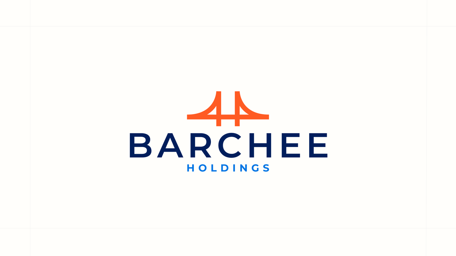
Barchee Holdings
A bold brand identity and a refined website for an Oklahoma private equity firm backing essential, enduring businesses across the Heartland.
The Challenge
Barchee Holdings backs essential, enduring businesses across Oklahoma and the surrounding states, the kind of companies that quietly hold up their communities. But a firm asking founders to trust it with their life's work has to look the part from the first impression. A new fund needed an identity and a presence that signal permanence, discipline, and care, not a generic template.
Private equity lives or dies on trust. A founder handing over a business they spent decades building is making one of the biggest decisions of their life, and they make it in part on how a firm carries itself. For Barchee Holdings, a new fund focused on essential businesses across Oklahoma and the Heartland, the brand had to project permanence and discipline from day one.
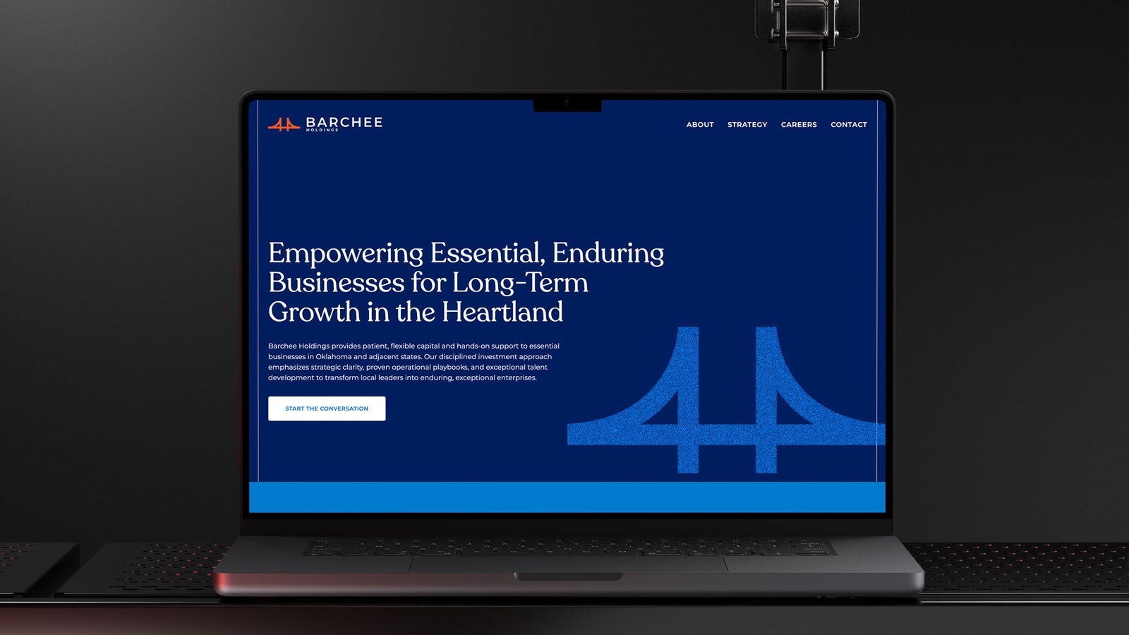
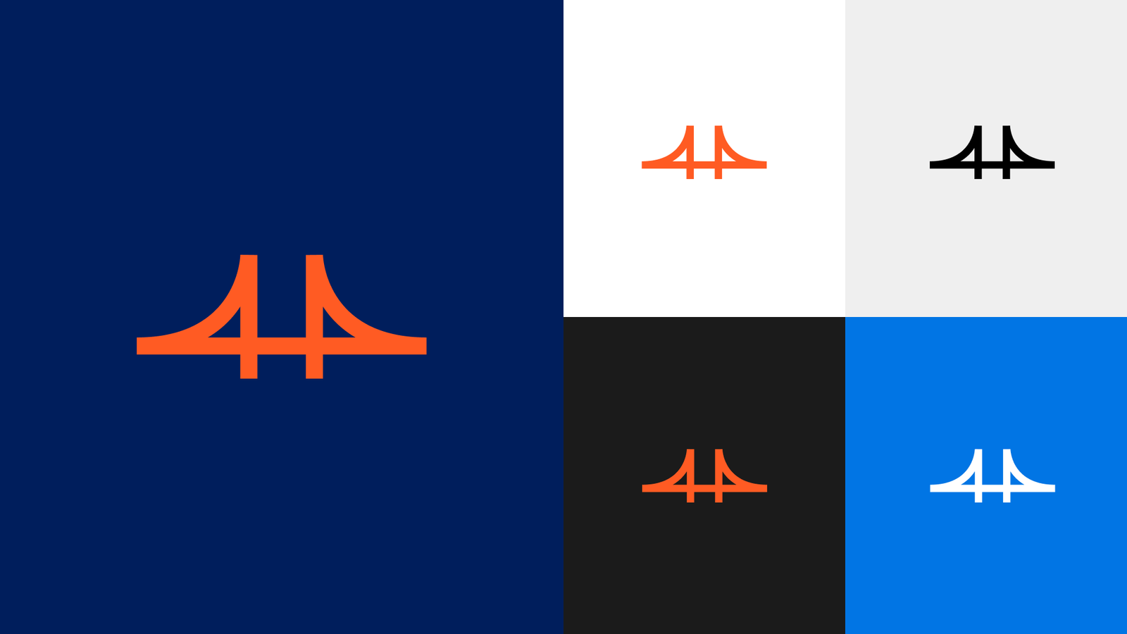
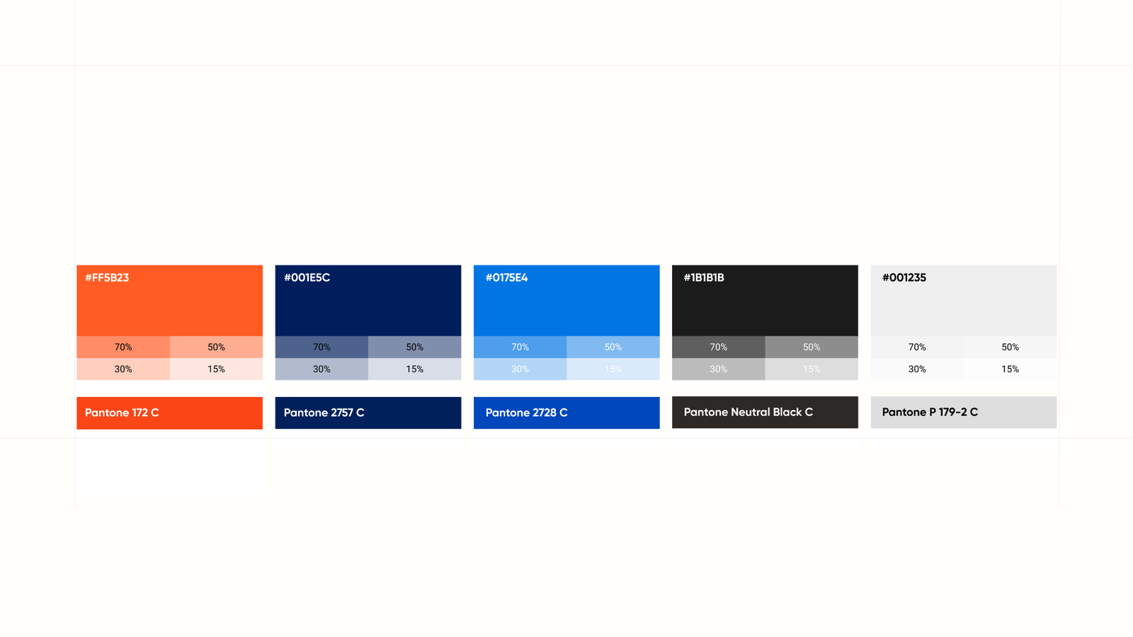
We built the identity around a bridge. It is a simple, memorable mark that carries everything Barchee stands for: connection, stability, and the long-term view the firm takes with every company it backs. A deep navy and a warm orange give it confidence without coldness, and a clean typographic system keeps it feeling institutional but human.
The website does the quiet work of building trust before a single conversation. It leads with a clear strategy, moves at a calm, deliberate pace, and keeps one obvious next step in front of the visitor: start the conversation. The result is a presence that makes a young fund look like an established partner, and gives Heartland founders a reason to reach out.
Brand system
A brand built
to earn trust.
The Outcome
A brand and website that make a young fund look established and trustworthy, and give founders a reason to pick up the phone.